Artist and photographer, Time Knowles is known for incorporating nature into his work and using it to play a major part in making process of his work. He uses nature within his work and the use of chance within nature and the environmental elements to create abstract and experimental drawings.

One series of drawings by Knowles is the 'Tree Drawings'. These drawings were produced by Knowles using the movement of the trees in the wind. He attached pens to the end of branches on different trees used large white surfaces perfectly placed so that they cached the movement of the trees via the pen strokes created by the branches as they moved in the wind. For this particular piece in 2005, he attached 100 ink pens to a weeping willow tree in Victoria park, London and placed a circular disk under the tree to catch the ink marks.
I think that the way Tim Knowles has used the natural movement of the wind to create drawings make the finished drawing more organic. The drawings haven't just been created by hand, the small marks on the paper that if were hand drawn could appear to mean nothing or bland , have been created using nature; in this case the movement of the wind and therefore I feel that it gives this particular type of drawings more depth. I really like how experimental the drawing are and how unpredictable the process is in creating them.
Tim Knowles also created a set of 'Balloon Drawings', these consisted of drawings produced by a pen suspended below a helium filled balloon drawing onto a slow moving roll of paper. The drawings produced can be up to 24 meters long as they plot the wind movements over a period of 24 hours. Knowles produced these balloon drawings on each of the highest mountains in England, Scotland and wales; Mount Snowdon, Ben Nevis and Scafell Pike.
With these set of drawing I feel that they are more structured and controlled than the Tree Drawings because some of his balloon drawings were in conjunction with weather reports and were more of a purposed and man made process with the mechanical paper and contraptions used to create the drawings as apposed to the simplicity of a canvas and the wind in the tree drawings. However I still like the experimentation that has gone into the work and the fact that no two drawing will be the same.


 Born in 1957 in China, Cai Guo-Qiang has worked with a range of mediums including performance art, video, installation and drawing. During the late 80's and early 90's; living in Japan he began to explore the uses of gunpowder in his drawings which in turn lead to him experimenting with explosives on a bigger scale. As a result of this came his signature explosion events. Guo-Qiang's work aims to connect the viewers to the universe around them and make them see more of the bigger picture and allow an approach to history and culture.
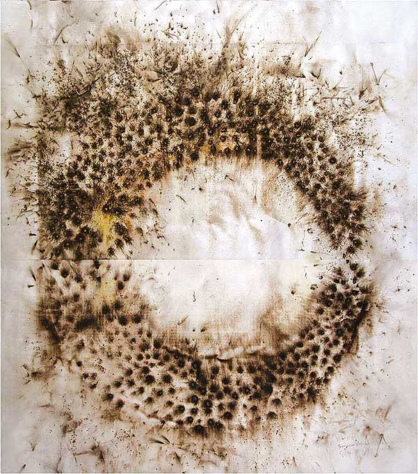


 In William Kentridge's drawings, you can see the theater influences that he includes in them that come from his love of theater. He also interests in linking drawing to film which shows in his graphic style characters in his drawings and his method of creating his film. Almost like stop frame animation he will take a photo of a drawing and then erase it and change the drawing slightly and then taking another picture of the changed drawing, continuing this until the scene has finished and when the photos are put together they create the film and a animated drawing.


 The Chinese artist that specializes in the ancient art of paper-cutting choses to stay close the routes of the art of the traditional folk art. His work consists of thousands of red hand cut paper dolls cut from red tissue paper and displayed is various different ways and various scales. The colour red is a good luck symbol in china and the tissue paper is normally used in celebrations such as weddings and new year and so the materials of his work bring something to the piece as well. The process is more than just art for Lu Shengzhong; the cutting out of little red figures is a spiritual and a performance which has been practiced for generations as an act to bring fertility to the families and as a symbol of ancestral continuity. This spiritual ritual gives Shengzhong meaning to his work and a powerful, cultural sense.
 German installation artist and film director, Rebecca Horn is most commonly known for her piece called 'Einhorn'. She works in areas such as installation, sculpture, film, performance art and poetry writing which is sometimes inspired by her artwork.
  Constructed textile designer turned paper-cut artist; Julene Harrison is an English artist and illustrator who specialises in mainly text based paper-cut pieces.


 In 2004 the Swedish designer; Sandra Backlund graduated from Beckman's college of design and soon found her own label that same year, she is now a well know fashion designer. Known for her sculptural and architectural clothing Backlund aims to exaggerate the female form and works with heavy wool, paper and hair to change proportions and dimensions of the female body.


 Born in England 1937, Tom Phillips is an English artist who takes up several preoccupations, this including painter, sculptor, composer, critic, curator and forms of poetry and writing.
 In 1966 Phillips set out to make a piece of art from the first second hand book he could buy for three pence; this began 'A Humument' which was the first and to be the longest series of his work including 4 editions. The pieces consist of Victorian books which once forgotten about have been reinvented using means such as collage, cut-up and other techniques. The series is still on going and is said to be only completed when all of the original pages from the books have been reworked. ON these reworked pages, Phillips has picked out certain words and phases and then linked them together by blocking out the other words on the pages, these phrases and sentences make up some of his personal quotations and saying which have been used by other artists in their work.
 Using his other talents such as painting portraits, Tom Phillips has used these in his books as the backgrounds to his work which also link in with some of the words that he highlights.
 Su Blackwell is most commonly known for her paper sculptures and dioramas. Graduating from the Royal college of Art in 2003 she has then moved on to create detailed sculptures made up of paper and used books to sculpt into dioramas that she displays in wooden boxes. Her choice of material being paper is used to reflect the fragile nature of the world and life in general, she uses irreversible and destructive methods within her work to reflect how easy it is for the destruction of life, hope and ambitions.


